Hyundai Motor Wins Red Dot Design Awards
London, 22 August, 2023, (Oilandgaspress) – Hyundai Motor Company reasserted its global design leadership by winning three prestigious Red Dot Awards for its acclaimed N Vision 74 concept, next-generation ‘Seon’ integrated infotainment design system and Hyundai Sans UI mobility UX typeface.
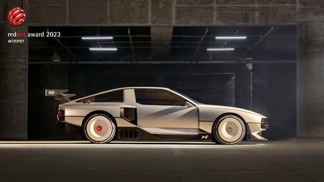
The N Vision 74 received a distinction in the Mobility & Transportation category in the Red Dot Award: Design Concept. The N Vision 74 high-performance hydrogen electric hybrid vehicle represents the past, present and future of the brand. It demonstrates the brand’s design vision for driving fun in a sustainable future.
More than a concept car, this ‘Rolling Lab’ is used for research, development and verification before its high-performance, motorsport-inspired technologies are applied to mass-produced models. N Vision 74 also pays homage to the design of the Pony Coupe concept that Hyundai presented in 1974. The Rolling Lab inherited the purity of the Pony Coupe concept, the dynamic proportions of the side silhouette and the special B‒pillar design with motorsport inspired details added.
The company also took two wins in the Red Dot Award: Brands & Communication Design 2023 for its connected car navigation cockpit (ccNC) infotainment system and its digital font.
Recognized in the Interface & User Experience Design category, ‘Seon’, which means ‘Line’ in Korean, is a completely new design system applied to Hyundai Motor’s ccNC infotainment system. With the motif of the horizontal lines existing in nature, the company developed ‘Seon’ from small graphic components to the entire display, and based on this, it completed the simple and flat graphic style of Hyundai. This graphic concept was designed to perfectly harmonize with the vehicle’s interior and exterior designs, including the consistency between displays.
Hyundai’s ccNC infotainment system applies the same grid system and common components for a consistent user experience between displays. In particular, the display hierarchy has been more clearly defined to make it easier for drivers to use while driving. Over the years, Hyundai Motor has worked on rearranging and optimizing features and information to make it easy for users to find and access. These efforts have led to the application of the company’s unique infotainment system that provides optimal usability in the driving environment and a consistent user experience across the entire display.
Recognized in the Typography category, Hyundai Sans UI is the company’s next-generation mobility user experience (UX) digital typeface. It was designed with mobility UX characteristics in mind but also software functionality based on aesthetics, legibility and brand identity.
Hyundai Sans UI inherits the formative design characteristics of Hyundai Motor’s brand typeface, Hyundai Sans. It also aims to provide optimal legibility in various driving situations and environments. In terms of visual structure, Hyundai Sans UI supports diversified typeface weight. By giving hierarchal order to the UI system, complex information can be displayed briefly. The italic typeface enables a delicate expression on the UI system and utilizes the typography suitable for each function.
Hosted by Design Zentrum Nordrhein Westfalen in Germany, Red Dot Award is one of the world’s largest design competitions. The award breaks down into three different disciplines – Product Design, Brand & Communication Design and Design Concept – to better appraise the diversity in the field of design.
Information Source: Read More
Energy Monitors , Electric Power , Natural Gas , Oil , Climate , Renewable , Wind , Transition , LPG , Solar , Electric , Biomass , Sustainability , Oil Price , Electric Vehicles, Crude Oil Markets, Crude Oil Supply Analytics,

